
Case Study: Hive & Bloom
Rooted in care, shaped by nature.
Hive & Bloom was one of those brands that arrived quietly for us. It’s a softer vibe, a slower pace, but no less impactful than other brands we’ve worked on. Hive & Bloom doesn’t push for attention or shout; it settles. Once you spend a moment with them, you realise everything feels considered; colours sit comfortably, the shapes feel familiar, and there’s a sense of care running through it all.
A brand shaped by beekeeping, local craft, delicious raw honey, and a respect for the natural rhythm behind it all. Honey that carries the character of its source. Something real, something made slowly, something worth holding onto.
So the identity needed to feel the same way.
A softer kind of structure
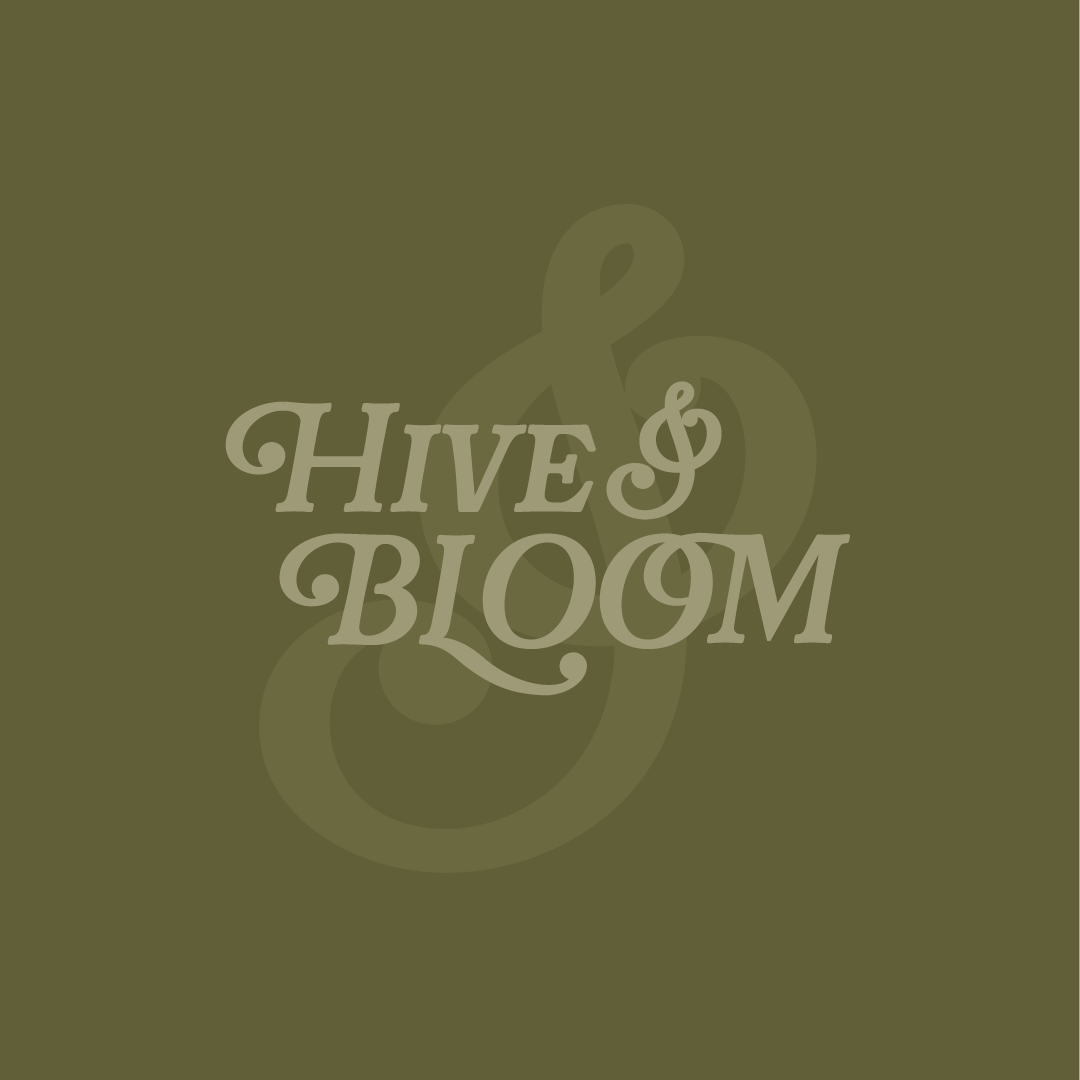
The typography is very much at the heart of this one, with its gentle flow and curves that feel almost hand-shaped (and technically, it was. We tweaked the font to match the vibe we were going for!). There’s enough detail to give it character, though it holds steady at a glance, and it feels rooted, familiar, and a little nostalgic in the best way.
Everything builds out from there. The supporting type steps back slightly; it’s cleaner and simpler, allowing the main wordmark to have the personality. There’s a quiet balance between expression and clarity that keeps the whole thing feeling settled.
Colours that feel like they belong together
This palette came together like ingredients rather than selections. Warm honey tones. Soft creams. Muted greens. A hint of something deeper to ground it. Each colour feels connected to the next, like they’ve been drawn from the same place.
Nothing pulls too sharply, and nothing demands attention.
Instead, the palette works together to create a sense of ease. You can move through it without interruption. It feels calm. Considered. Whole.
Details that live beyond the logo
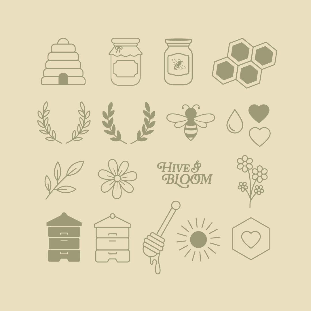
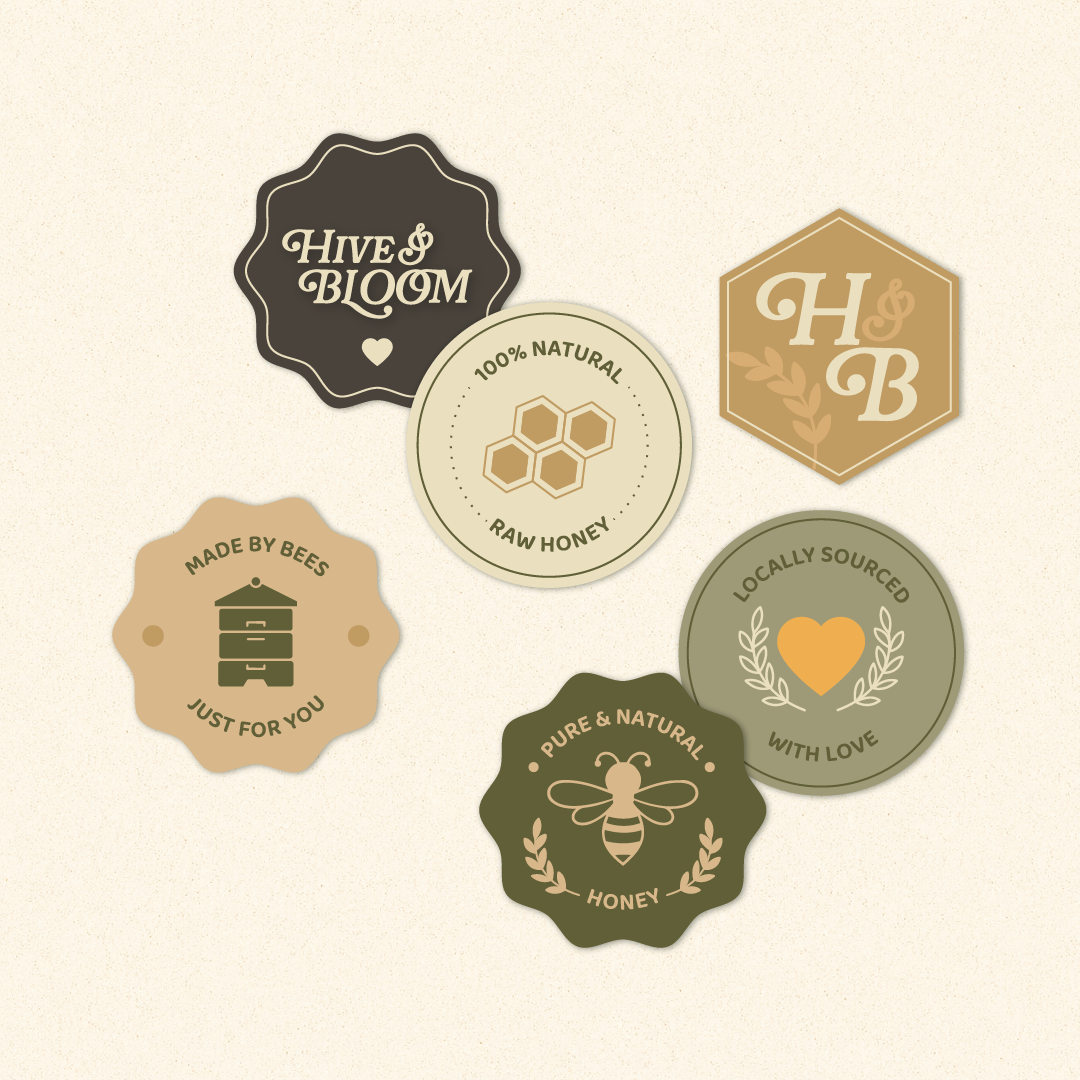
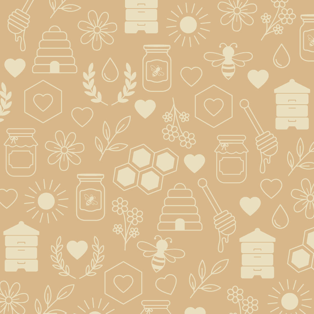
This is where the personality really opens up. Bees, hives, florals, small natural motifs. They appear across the brand in a way that feels light and intentional and, importantly, they don’t crowd the logo or compete for space. They live around it.
That gives the brand room to expand. Packaging, printed materials, small touchpoints. Each one carries a piece of the story without overwhelming the whole.
Bringing it into the real world
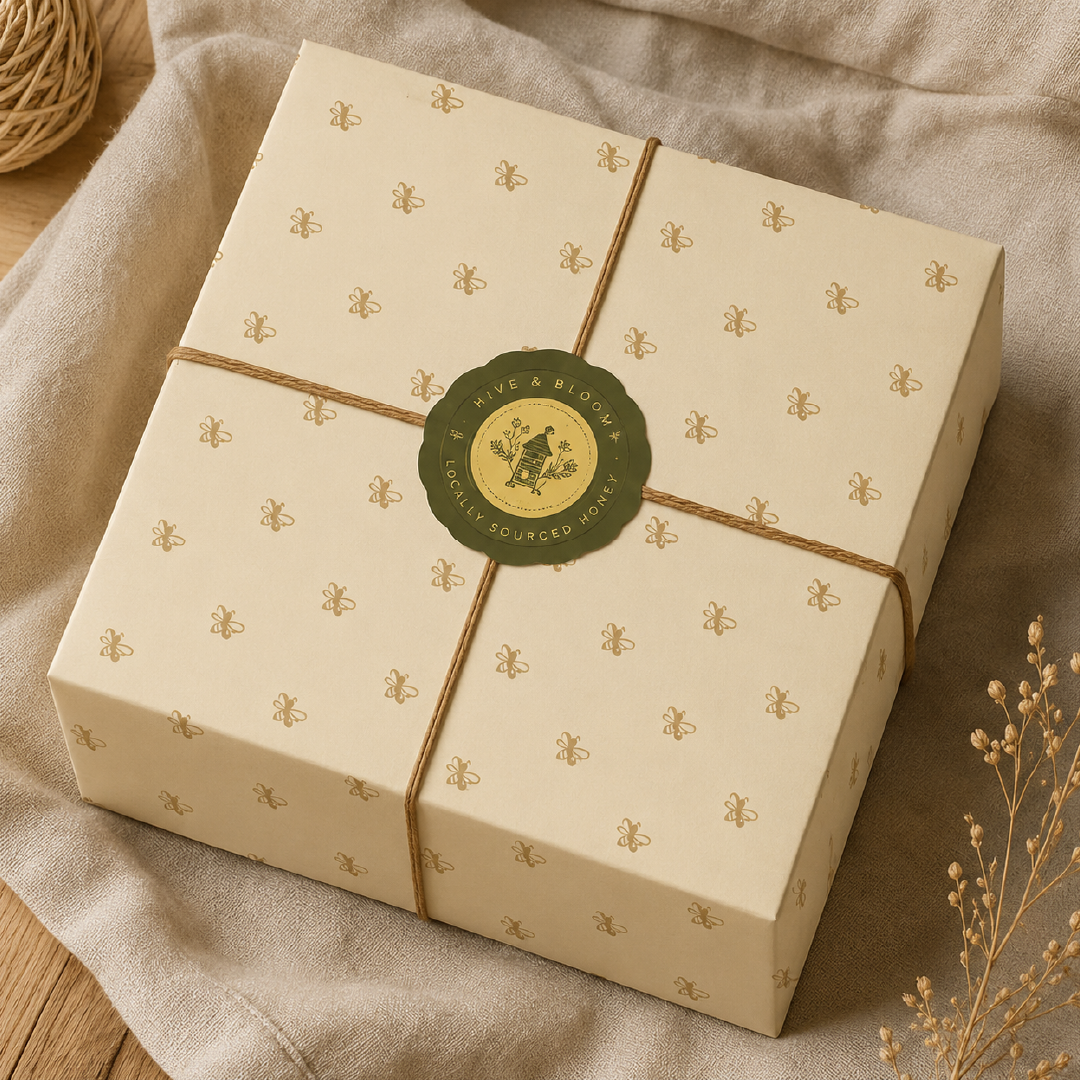
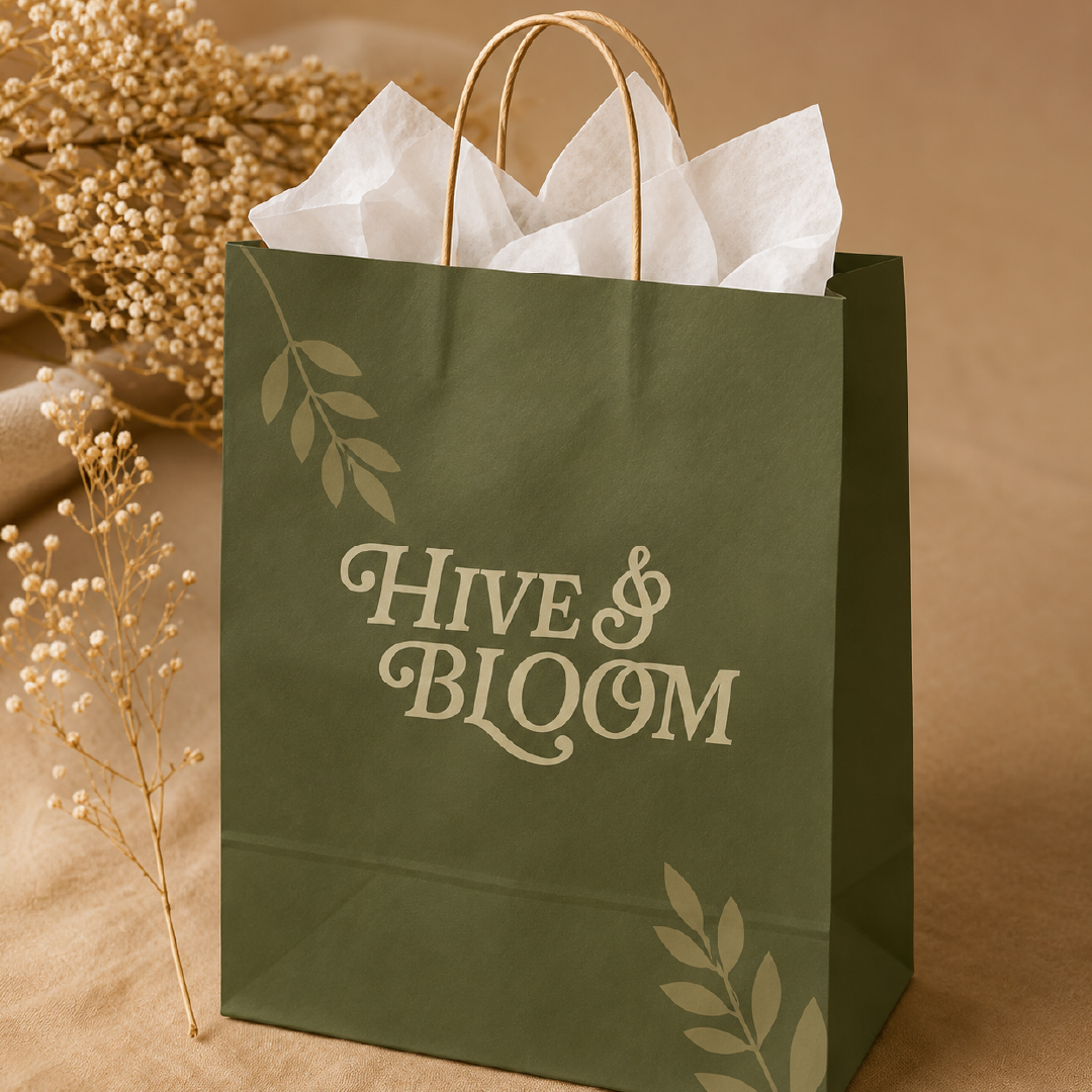
This is always the moment where things either hold together… or drift. Here, everything settles. The wrapping paper with the soft repeat pattern, almost like a quiet background hum. The labels sit neatly into place. The palette translates across materials, from paper to print to packaging.
You can imagine receiving it, holding it, and opening it slowly. That was really the feeling we were going for with this one.
Small touches that stay with you
Sometimes it’s the smallest pieces that make the strongest impression: a thank you card or a simple sticker, or a repeated icon that begins to feel familiar over time. These details don’t ask for attention. They build it quietly. And before long, the brand feels recognisable without needing to explain itself.
Letting it all come together
There’s a rhythm to this kind of work: you begin with something simple, maybe a tone or a sense of direction. Then you layer carefully, letting things fall into place. You step back, adjust, let it breathe again.
Hive & Bloom never needed to be loud to be noticed. It holds its shape through consistency and softness, with a quiet confidence that runs all the way from the logo to the smallest printed detail.
And that’s often where the interesting brands sit - not at the centre of attention, just… somewhere you want to stay a little longer.
Looking to bring your own community brand to life? We’d love to help. Reach out here or browse our branding packages to see what fits.
