
Case Study: STATIC//HEART Branding
Broadcasting emotion in distortion.
There’s a moment, right at the beginning of a project, where something clicks. It isn’t always with a loud bang or anything dramatic; more of a… quiet recognition. Our latest project arrived as a feeling and a quiet “Oh!”
STATIC//HEART lives in that space where things start to break apart a little. Where sound distorts, visuals fragment, and suddenly there’s something more honest sitting underneath it all.
So the question became: How do you design for that?


The Idea: Signal Meets Feeling
The core of STATIC//HEART is beautifully simple: it’s a large network of creators, all tuned to the same frequency. Music, design, production, digital work. Different outputs with a clear, shared intent. Everything about STATIC//HEART circles one idea:
Signal carries emotion. Distortion reveals it.
That tension shaped everything that followed. Clean structure. Disrupted surfaces. Sharp typography. And glitch interference creeping in at the edges. You can feel the push and pull.
Building the Identity
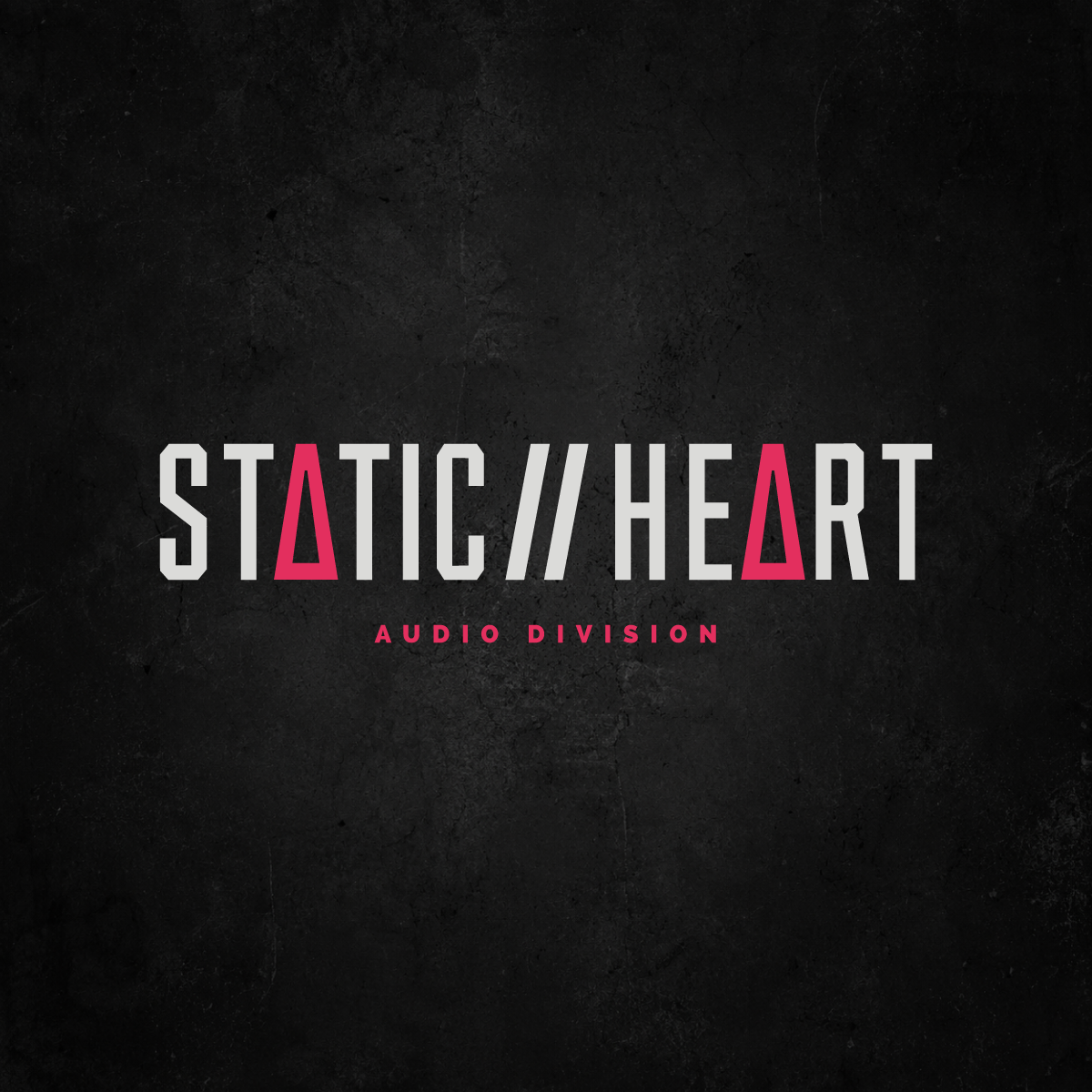
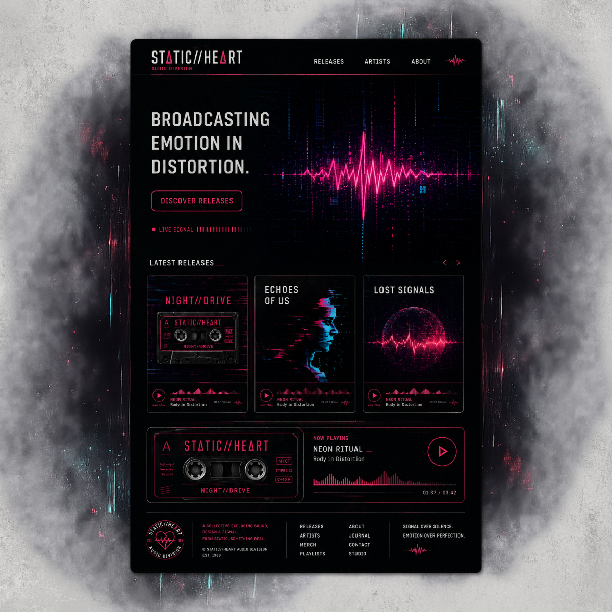
The logo does a lot of quiet storytelling. STATIC//HEART sits strong and grounded, but those altered “A” characters change the tone instantly. They’re a small disruption, but enough to make your brain pause for half a second. And that’s where the magic lives.
The supporting mark leans into it further: a heart line, pulsing like a waveform. Something human, translated through signal. We aimed for emotional and technical in equal measure. The logo doesn’t pick a side.
Colour & Texture: Where It Gets Interesting
This is where things start to breathe. A deep, almost industrial black sits underneath everything, with sharp hits of neon pink and cyan cut through like signal spikes. We wanted the brand to feel alive and a little unstable (in the best way!). The textures also do a lot of heavy lifting here: subtle grain, light distortion, moments of interference. Nothing overwhelming, but just enough to stop things feeling too clean. Because clean wouldn’t make sense for this brand.
Assets That Feel Like Artefacts
One of the most fun parts of this project? Turning brand elements into objects. The labels and tape strips and signal warnings are all little fragments that feel like they’ve been pulled from a studio desk or a half-corrupted archive. They give the brand something tactile. Something you can almost pick up.
And suddenly, STATIC//HEART stops being a concept and becomes an entire world.


The Takeaway
This project sits right in that sweet spot we love exploring, where structure meets chaos, where digital feels human, where a brand becomes something you experience rather than just recognise.
STATIC//HEART doesn’t try to smooth things out. It leans into the edges and lets the distortion speak. It trusts the audience to feel it.
And honestly? That’s where the good stuff is.
Looking to bring your own community brand to life? We’d love to help. Reach out here or browse our branding packages to see what fits.