
Case Study: Brambleroot & Ink Branding
A little art shop with big personality (and an even bigger heart).
Some branding projects begin as whispers. Others come in like a full symphony of wildflowers and ink stains, and that’s exactly how Brambleroot & Ink arrived. This dreamy little business is warm, whimsical, and rooted (pun entirely intended) in the belief that art supplies should be as inspiring as the art they help create.


The Story of Brambleroot & Ink
Tucked away in a mossy corner of Somerset, Brambleroot & Ink is an independent art shop run by the endlessly curious (and slightly chaotic) Poppy Fenwick, a watercolourist turned shopkeeper. She believes that creativity grows best when it’s tangled, joyful, and just a bit unruly, like the brambles that inspired her shop’s name.
Poppy sources everything with care: handmade sketchbooks from a local papermill, natural-pigment paints from an indie chemist, and inks that shimmer ever so slightly when the sun hits just right. There’s a little bell over the door, twine-wrapped shelves, and usually a half-finished drawing on the counter.
Mission Statement
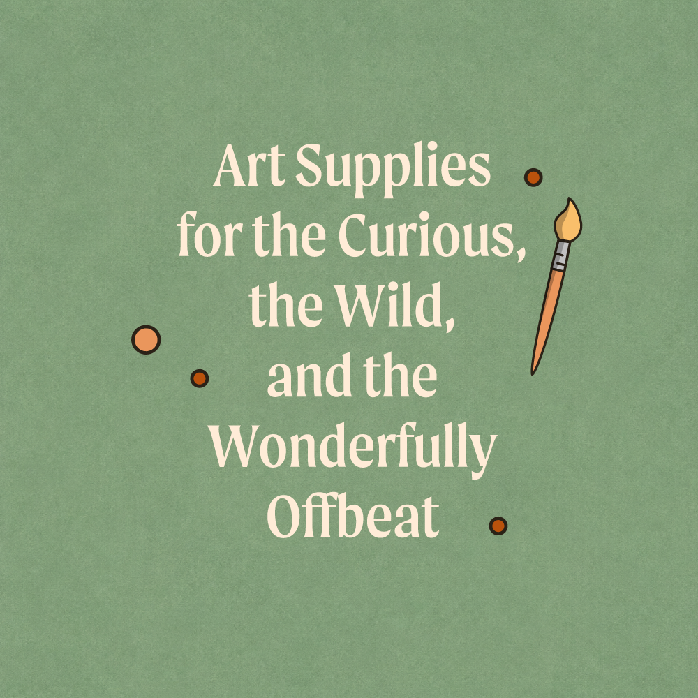
At Brambleroot & Ink, we believe creativity is tangled and sprawling, like a hedgerow in spring. Our mission is to equip artists with tools that inspire not just better work, but bolder play. From hand-blended inks and sustainable sketchbooks to paints that practically hum with possibility, every item we stock is chosen for its quality, charm, and potential to make magic.
Designing the Logo: From Sketch to Sprig
The idea behind this visual identity was simple: capture the wild warmth of a shop like this. Something that feels lovingly hand-picked and quietly magical.
We started with three paintbrushes, each with a slightly different tip and colour, representing the range of creative styles the shop embraces. These aren’t factory-perfect brushes. They’re the kind you’ve used a hundred times, that still have a smear of ochre on the handle. Beloved. Familiar.
Surrounding them, we added illustrated branches and berries, organic shapes that nod to the “bramble” in the name and echo the earthy Somerset surroundings. We kept the palette warm and muted: soft terracotta, moss green, a gentle peach. The kind of colours you’d find in a botanical sketchbook or a countryside mural.
The typeface? We chose something rounded and flowing with a slightly retro edge. It needed to feel friendly and grounded, like handwriting with just enough flair.
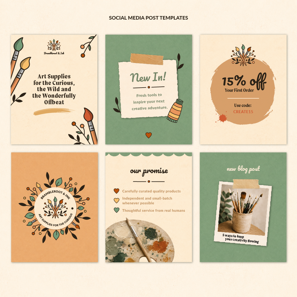
Supporting Assets: Patterns & Practical Magic
Once the main logo was complete, we couldn’t resist bringing the identity to life with a few supporting pieces. After all, a brand like this deserves to breathe beyond a single image.
So, we created two seamless patterns using the same brushes, leaves, and berries from the logo, ideal for packaging, tissue wrap, branded stationery, or even wallpaper inside the shop. (Honestly, if Poppy did wallpaper a little corner of Brambleroot, we think it would look exactly like this.)
To make the brand feel even more tangible, we mocked up a canvas tote bag featuring the logo, something you might genuinely pick up at the till, stuffed with sketchbooks and pastel tins. These little real-world touches help anchor the identity, turning an idea into something that feels lived-in and loved.


Final Thoughts
Creating Brambleroot & Ink was an absolute joy. Projects like this remind us how much character and storytelling can be packed into a single brand. We wanted the shop to feel alive, like you could hear the creak of the floorboards and smell the pencil shavings.
And that’s what we aim to do with every Cosy Fox project: bring a little magic to the practical, a little heart to the strategy, and a whole lot of personality to the visuals.
If you’ve enjoyed this case study, we’d love to know: would you shop at Brambleroot & Ink?
(And if you’ve got a brand that needs a little of this kind of magic, you know where to find us.)