
Case Study: FriendPaths Branding
Designing a brand to bring people together, one walk at a time.
We love working on projects that bring a little more connection into the world, and FriendPaths is exactly that kind of brand. Based in the beautiful countryside of Dorset, FriendPaths exists to help people get active, build friendships, enjoy the outdoors, and boost their wellbeing through the simple magic of walking.
Our job? Create a visual identity that felt just as welcoming, down-to-earth, and hopeful as the community behind it.


The Mission
FriendPaths came to us with a beautiful goal:
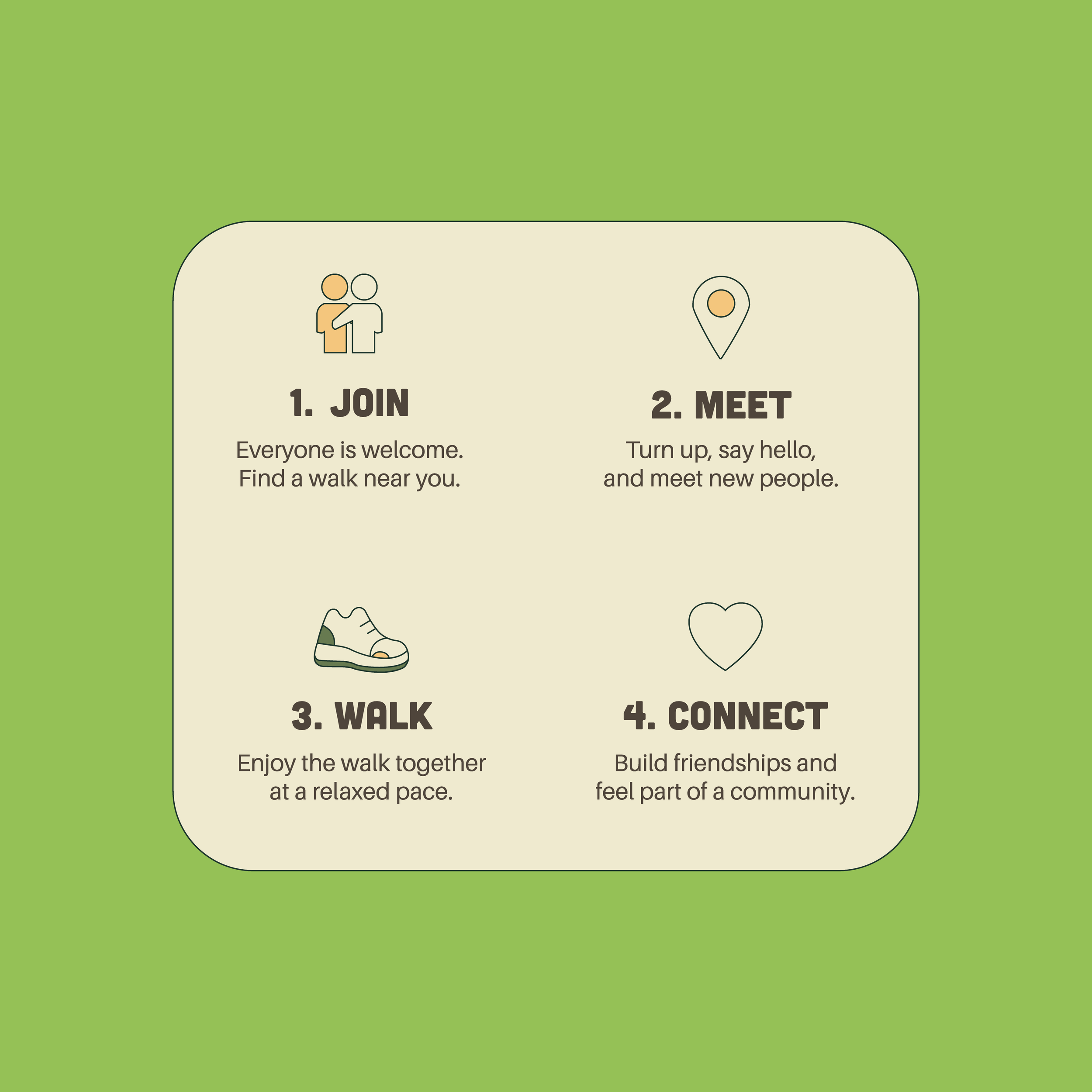
To bring people of all ages and backgrounds together through nature, encouraging meaningful connections and improving wellbeing, one walk at a time.
It was about more than fitness. More than socialising. It was about belonging. Reconnection. Slowing down in good company.
We knew right away that the branding needed to reflect all of this without feeling overly corporate or clinical. It had to feel warm. Local. Alive.
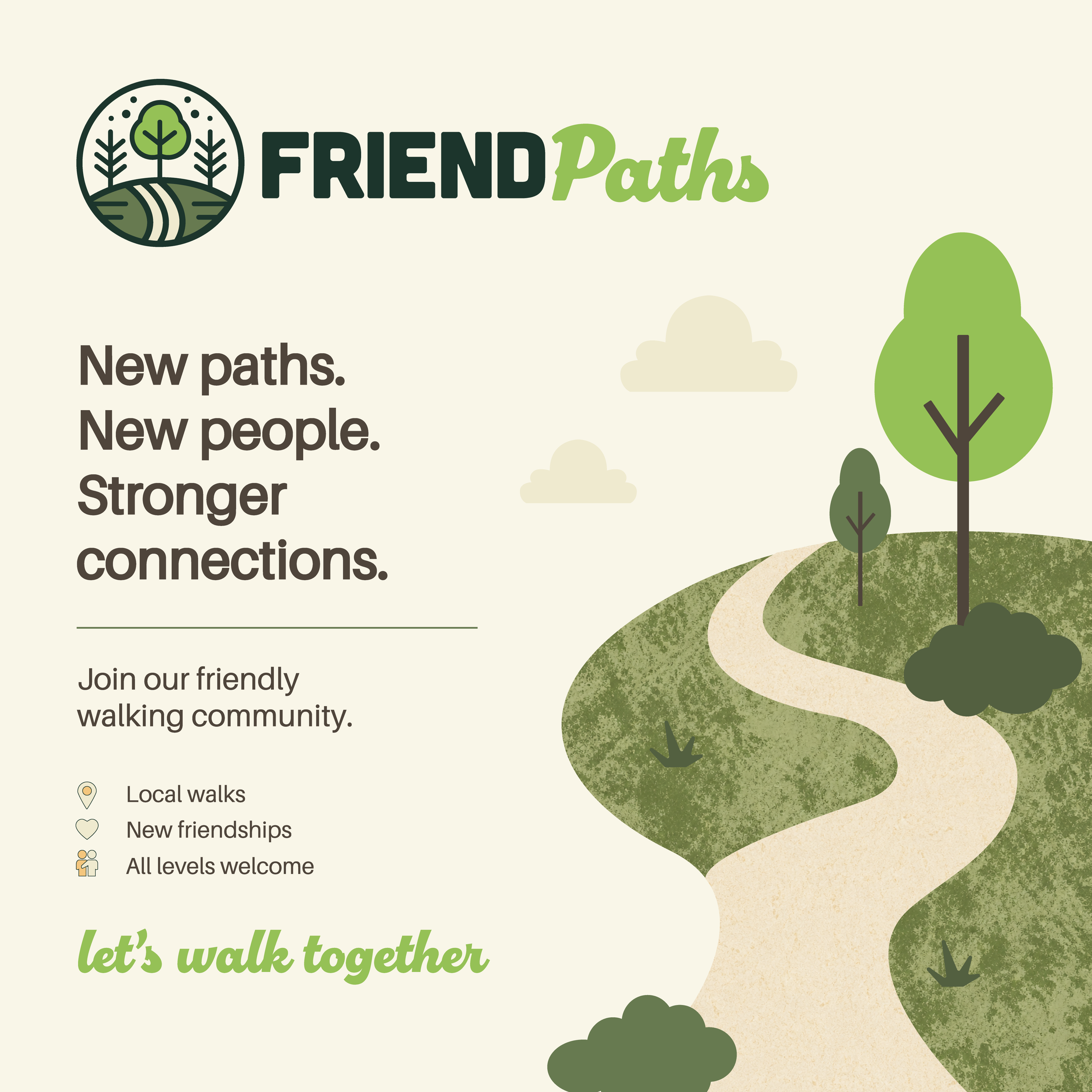
The Logo
We designed a circular emblem featuring a gentle winding path leading through trees and open hills. Grounded, calming, and clearly connected to nature. The linework is soft but clean, and the icon could easily be used as a standalone mark on signs, badges, apparel or digital spaces.
Font Pairing
We paired two distinct fonts to reflect the heart of the brand:
“FRIEND” (font name: Cubano) is set in a bold, modern sans serif. Strong, grounded, clear. It anchors the logo and makes the name feel instantly trustworthy.
“Paths” (font name: Chill Script) uses a script-style font with soft curves, adding warmth and approachability. This gentle contrast helped us visually reflect the brand’s balance between structure (community, organisation) and flow (movement, nature, connection).
The Colour Palette
Inspired by Dorset’s lush countryside, we chose a palette of deep green, soft moss, and fresh leafy tones, with a clean off-white background. The goal? A look that felt both calming and invigorating, like stepping into a quiet woodland morning with new friends and a flask of tea.
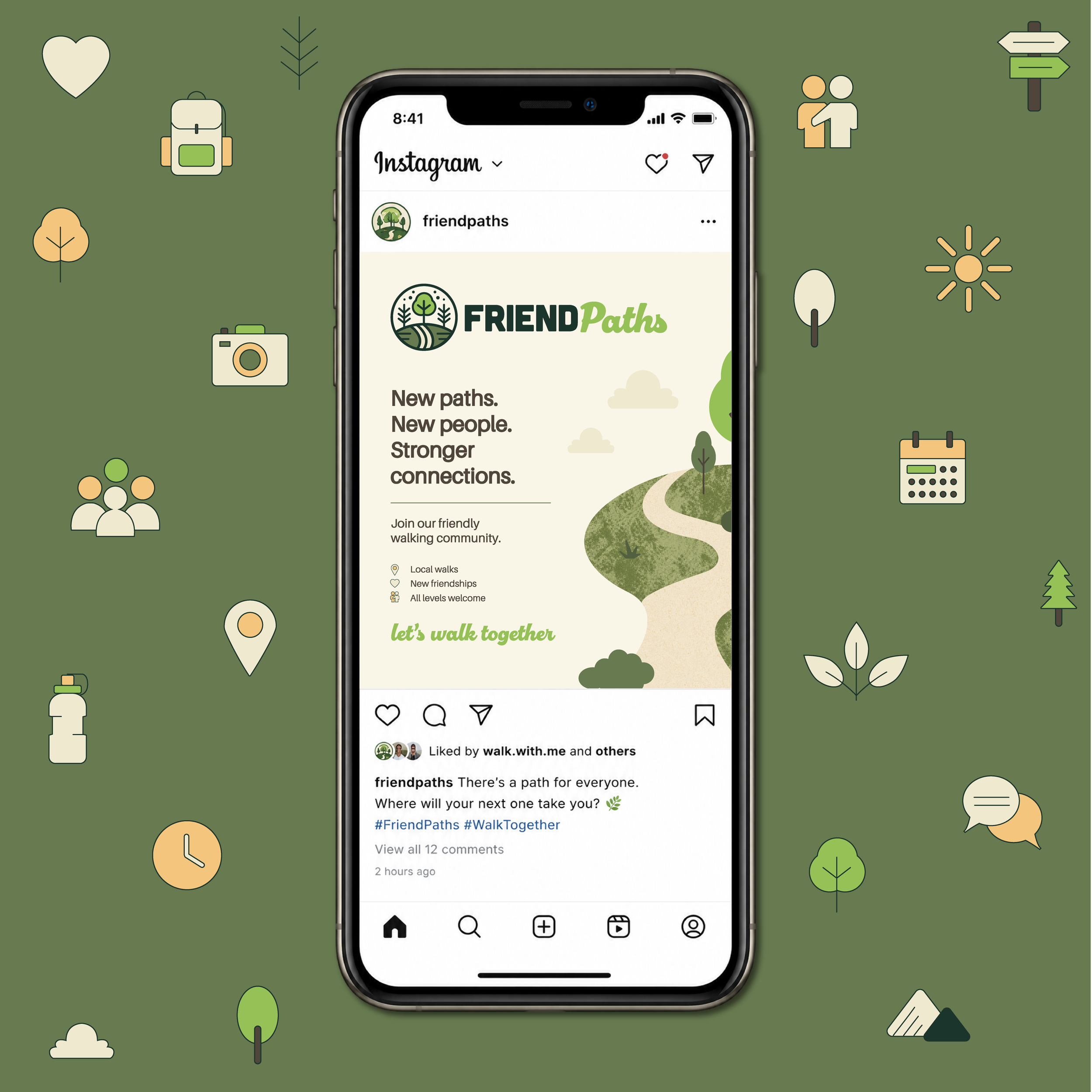
Applications
We created a flexible identity that could be used across:
Printed trail maps and wayfinding signs
Social media and community event posts
Pin badges, leaflets, and welcome packs
Branded walking gear (caps, tees, bags—all on the wishlist!)

The Result
The final brand identity helped FriendPaths launch their initiative with clarity and confidence. They now have a visual presence that reflects exactly who they are: inclusive, nature-loving, and community-led.
It’s a brand built for connection, and that’s exactly what it’s helping to create.
Looking to bring your own community brand to life? We’d love to help. Reach out here or browse our branding packages to see what fits.