
Case Study: GG (Girl Gamers)
Designing a brand that champions women in gaming, loudly and proudly.
Some projects land in your inbox and you just know they matter, and for us, GG (Girl Gamers) Collective was one of those.
Built to empower women in gaming, GG exists to challenge stereotypes and amplify female voices, and create a genuinely supportive space where passion and creativity can thrive. We’re not just talking about games (although, yes, we absolutely love those), but also about confidence, visibility, community, and making room in an industry that hasn’t always been great at it.
Our job was to create a brand identity that could hold all of that at once. Bold, but not aggressive. Inclusive, without feeling generic. Strong, while still warm and welcoming.

The Mission
GG came to us with a clear goal (and a strong sense of what they didn’t want): to build a safe and welcoming community for women in gaming. One that celebrates diversity, encourages collaboration, and actively uplifts gamers of all backgrounds; a space designed to support skill and passion, not gatekeep them. They wanted to challenge outdated perceptions, shine a light on the talent already within the community, and create something empowering rather than exclusionary. A place where people could show up as themselves, swap stories, play together, and grow in good company.
Which meant the branding couldn’t fall back on tired clichés or lean too heavily into “hardcore” gaming visuals. It needed confidence (absolutely!) but also warmth. Energy. Joy.
A brand that said: you belong here.
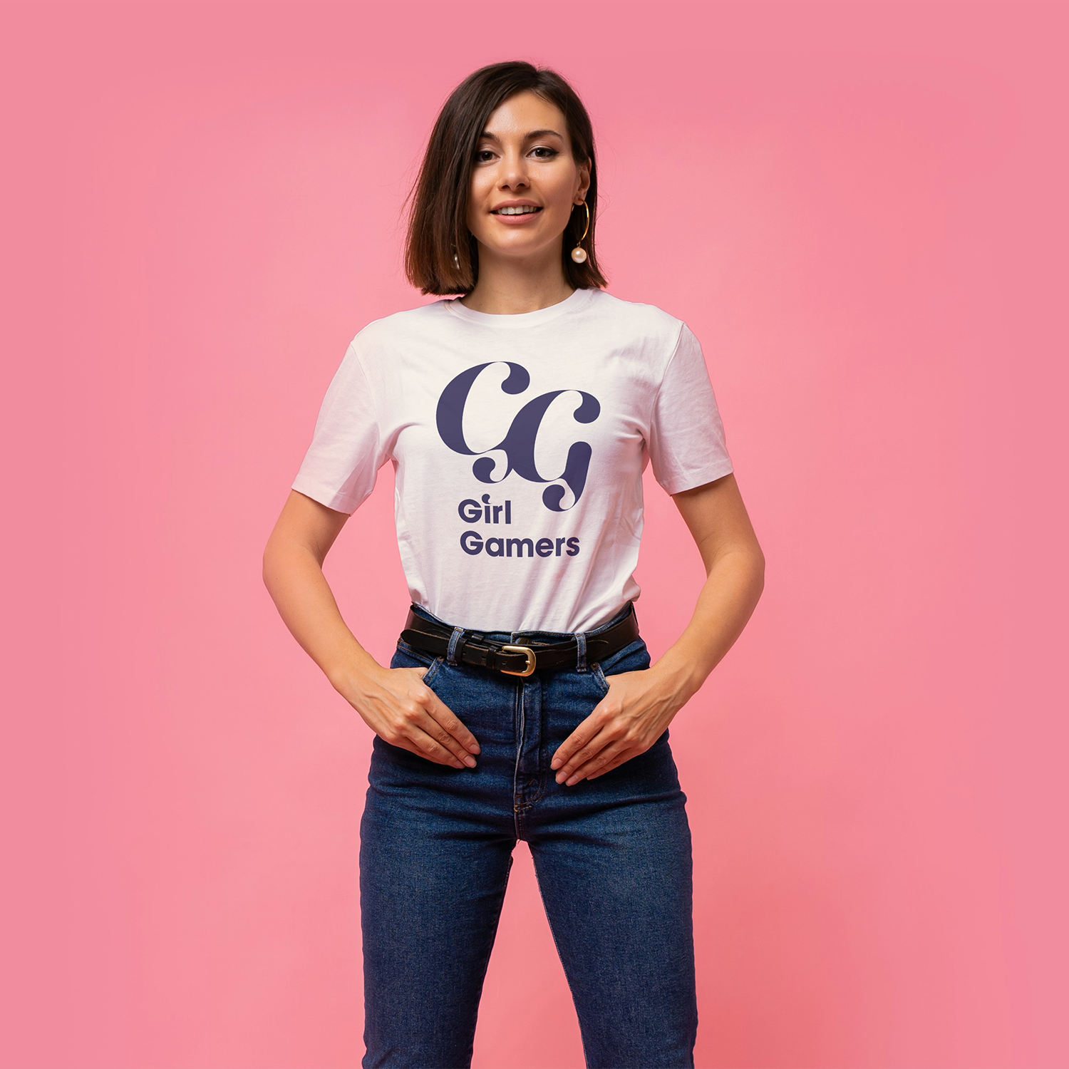
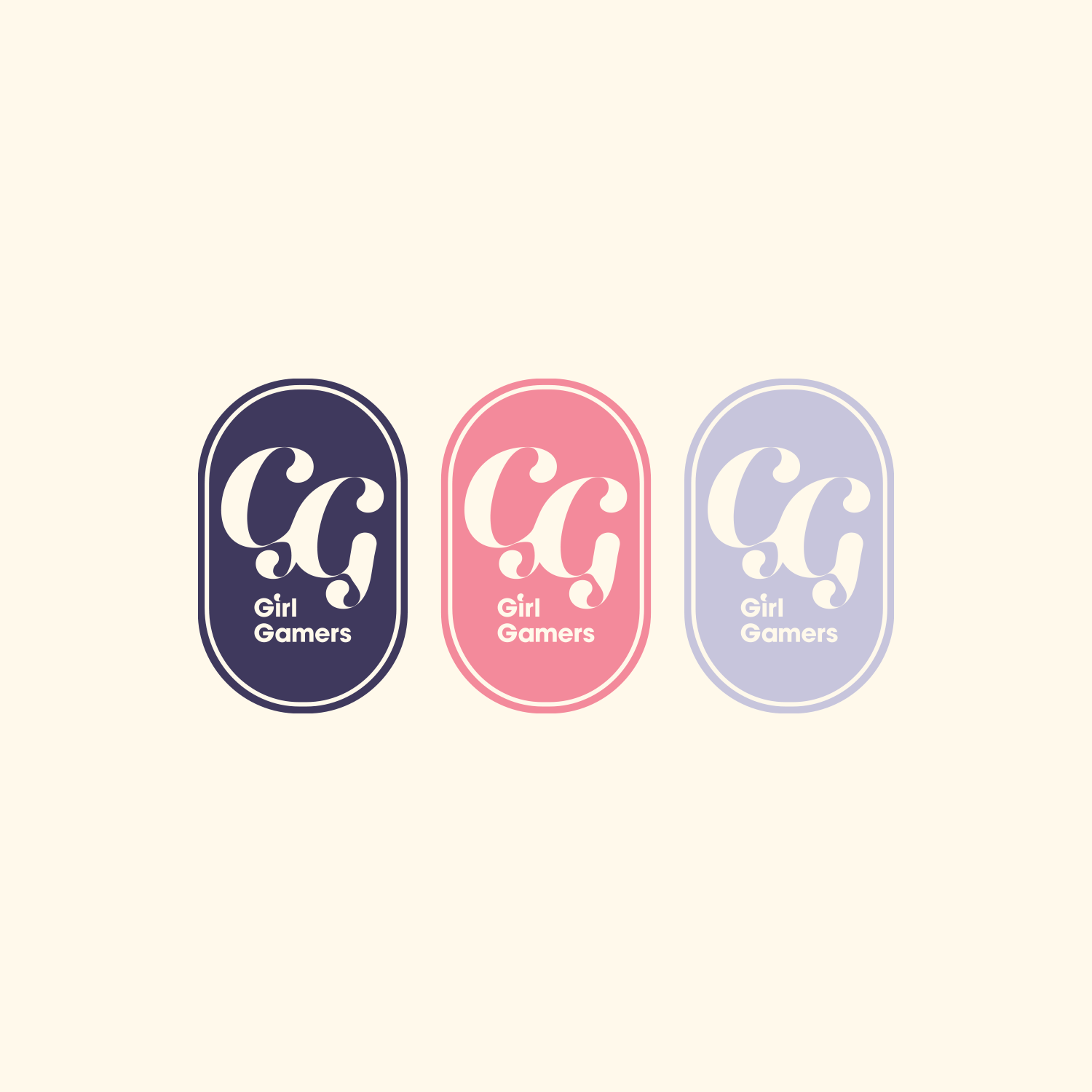
The Logo
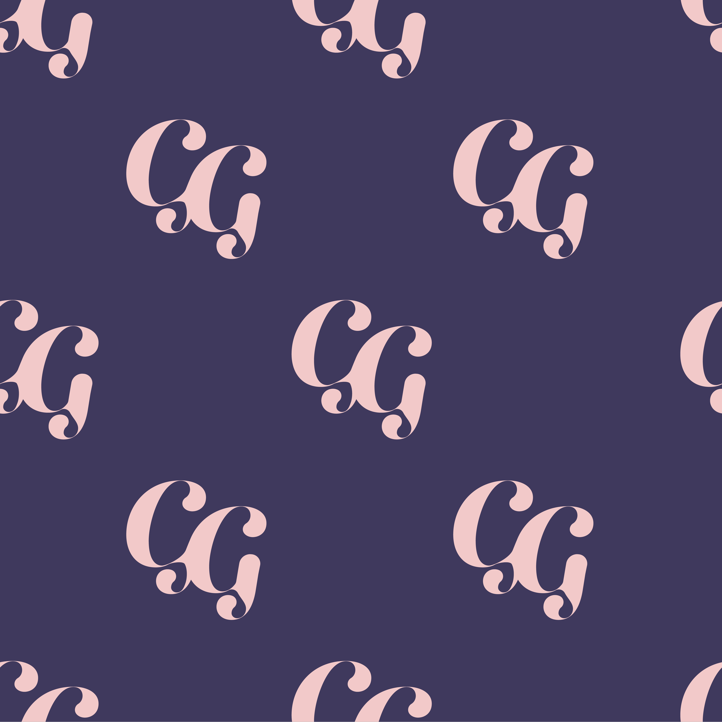
At the heart of the brand is a bold, oval-shaped emblem built around the GG monogram. The shape is softly rounded but confident — more protective than closed. It reads as a badge of belonging, not a barrier.
The lettering was fully customised in Illustrator, created specifically for this project. Nothing off-the-shelf. The generous curves give the logo warmth and personality, while avoiding anything sharp or aggressive. It feels strong, but friendly. Assertive, without being intimidating.
Because the logo lives inside a self-contained emblem, it’s incredibly versatile. It works just as well as a standalone icon for social avatars and stream overlays as it does on badges, stickers, and merch — clear, recognisable, and full of character, even at small sizes.
A symbol people can rally around.
To support the custom logo lettering, we paired it with ITC Avant Garde Gothic Pro Bold, a clean geometric font that’s highly readable.
The Colour Palette
The colour palette brings together deep purple, lilac, pink, and a soft cream base.
Deep purple grounds the brand, giving it confidence and weight. Lilac softens things, adding warmth and openness. Pink brings energy and visibility, but is celebratory, not stereotypical. And the creamy background keeps everything feeling light, friendly, and easy to spend time with.
Together, the palette feels empowering without being harsh. Playful without tipping into childish. A reminder that strength and softness don’t have to sit at opposite ends of the scale.
Applications
The identity was designed to thrive wherever the GG community shows up, which means it needed to be flexible from day one.
It works comfortably across:
Social media graphics and community announcements, where clarity really matters
Stream visuals and event promotions, holding its own without stealing the spotlight
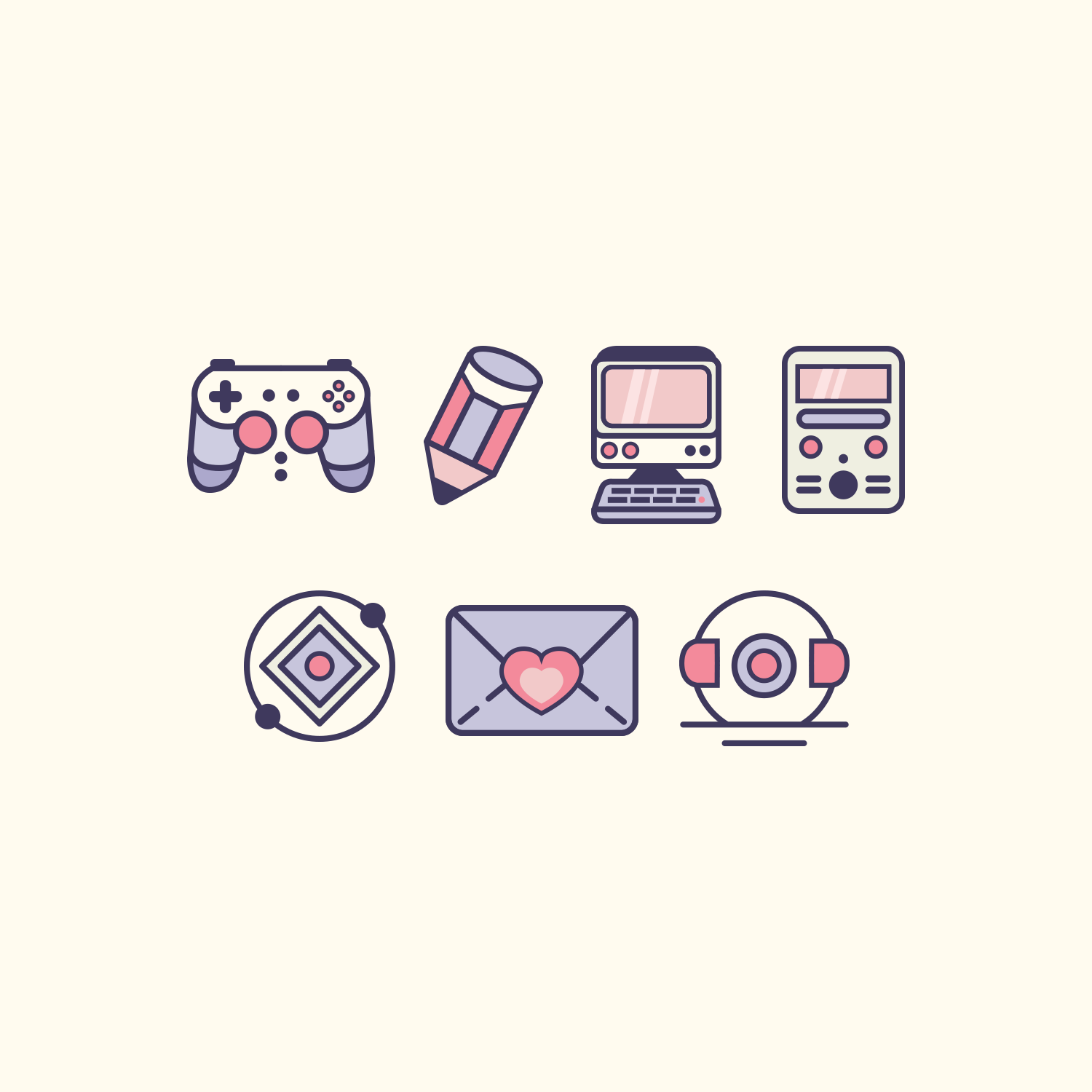
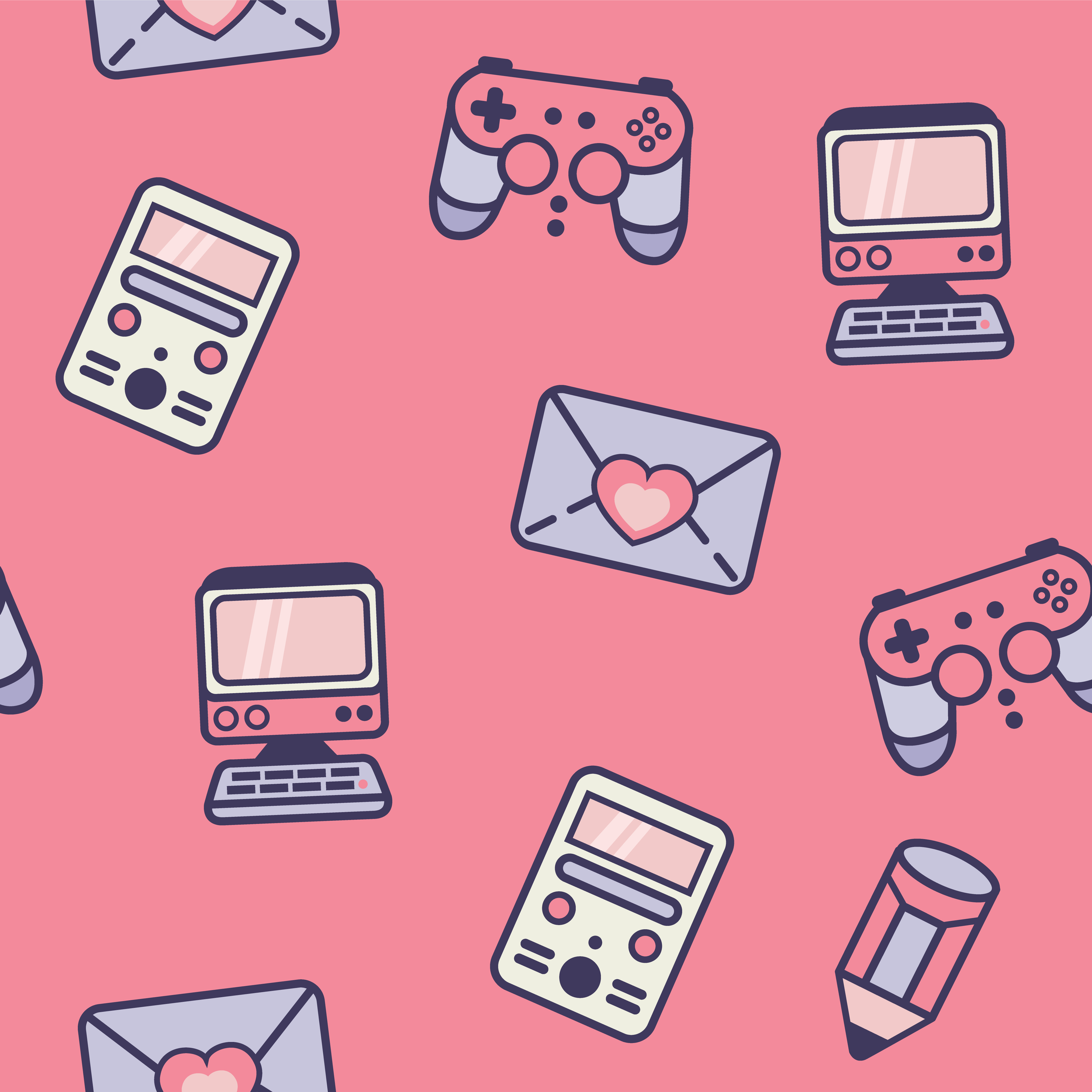
Backgrounds, banners, and repeat designs, using icon and pattern elements to add personality without visual overload
There’s also plenty of room for growth:
Merch and stickers (always a good sign)
Discord spaces and Twitch overlays
Future collaborations and community-led projects
The system is recognisable and adaptable, and built to grow alongside the people using it.
The Result
The final identity gives GG (Girl Gamers) Collective a confident, cohesive visual voice: one that reflects their values without falling back on tired clichés. It’s bold and welcoming, with community at its centre. A brand that feels safe to step into, but solid enough to stand its ground when it needs to.
Exactly the kind of space GG set out to build.
Looking to bring your own community brand to life? We’d love to help. Reach out here or browse our branding packages to see what fits.