
Case Study: Everlong Scents
Designing a brand that lingers. Soft, familiar and made to be lived with.
Everlong Scents is a brand built around scent, but it’s also more than that… It’s atmosphere. The kind you don’t always notice at first, but feel immediately when it’s gone. Warmth. Freshness. A little pocket of calm in the middle of everything else.
The goal was to build a brand that could settle into someone’s space naturally; something that feels good to come home to.

The Mission
Everlong Scents began with a clear intention: to shape everyday moments into something softer and more considered (but with a playful twist).
A candle becomes part of the morning routine, flickering gently beside a cup of coffee. Light settles into the room as the day unfolds, carrying a sense of calm that lingers long after it’s lit. Evenings gather around that same glow, the small ritual of striking a match marking the shift from noise into stillness.
The brand needed to carry that feeling with it. Something grounded and steady, with warmth woven through every detail. A presence that settles naturally into a space, becoming part of it instead of sitting apart from it.
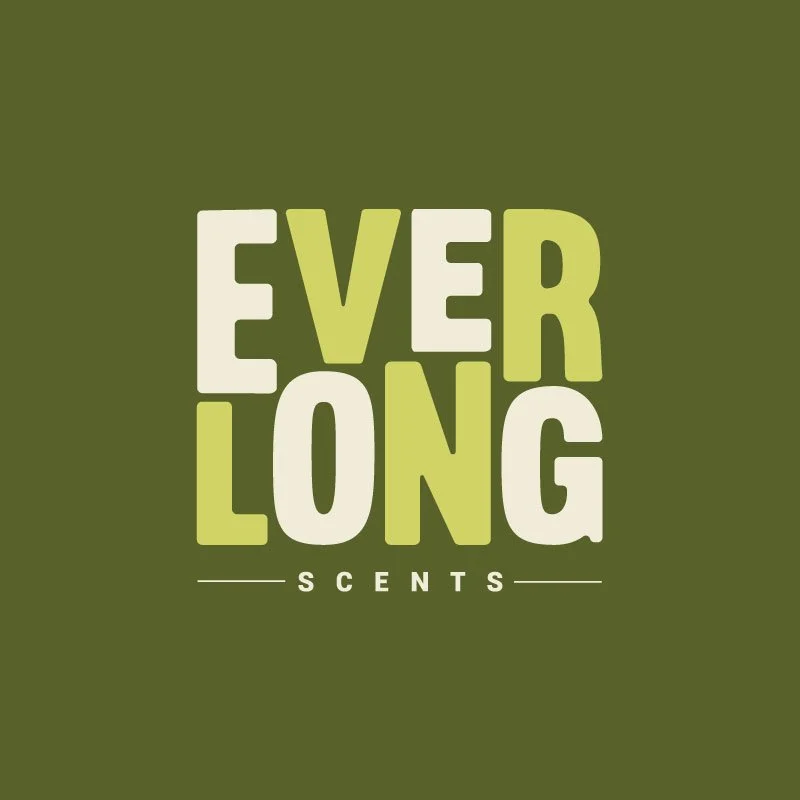
The Logo
The logo builds its presence through balance and rhythm, drawing the eye in with bold, stacked lettering that feels steady and assured.
“EVERLONG” holds the centre, each letter carefully shaped to sit comfortably alongside the next, creating a sense of cohesion that feels both structured and inviting. Subtle colour variation moves across the word, softening the weight and introducing a quiet sense of movement. Beneath it, “SCENTS” opens the design outward. The increased spacing gives the mark room to breathe, allowing the composition to settle into itself with ease.
We wanted it to carry the feeling of something held, something kept, a small detail that invites a closer look. Together, these marks create a system that moves comfortably between bold visibility and quieter, more intimate moments of the brand.
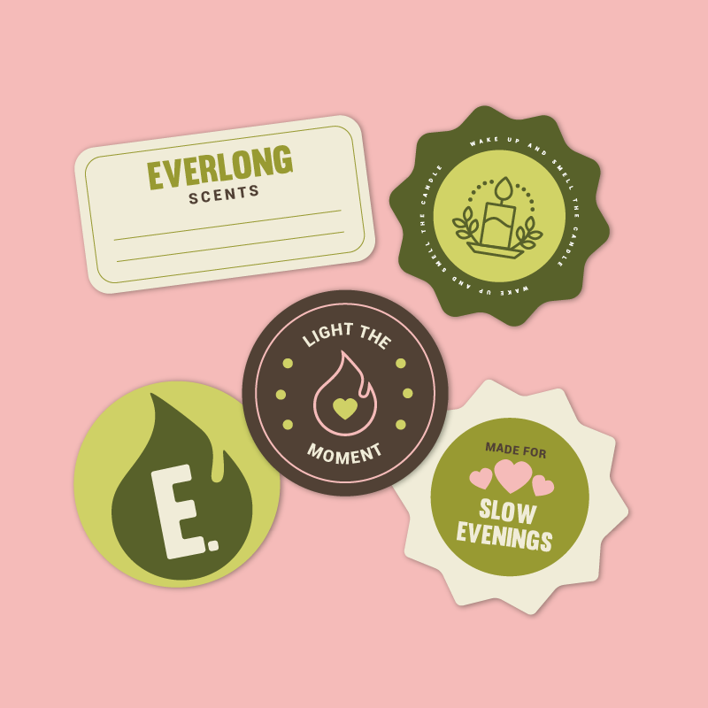
The Colour Palette
This is where we probably had the most fun with the brand. Colours! We used muted olive green to anchor the brand and bring a sense of calm that feels both natural and familiar. It settles into the background with ease, forming a foundation that supports everything built around it.
Soft, dusty pink moves alongside it, introducing warmth that feels lived-in and welcoming. The two colours meet in a way that feels balanced, each enhancing the other without competing for attention.
Lighter, creamy tones lift the palette, opening up space within the design and allowing each element to breathe. The result is a combination that feels comfortable to spend time with. Steady and warm and softly atmospheric.
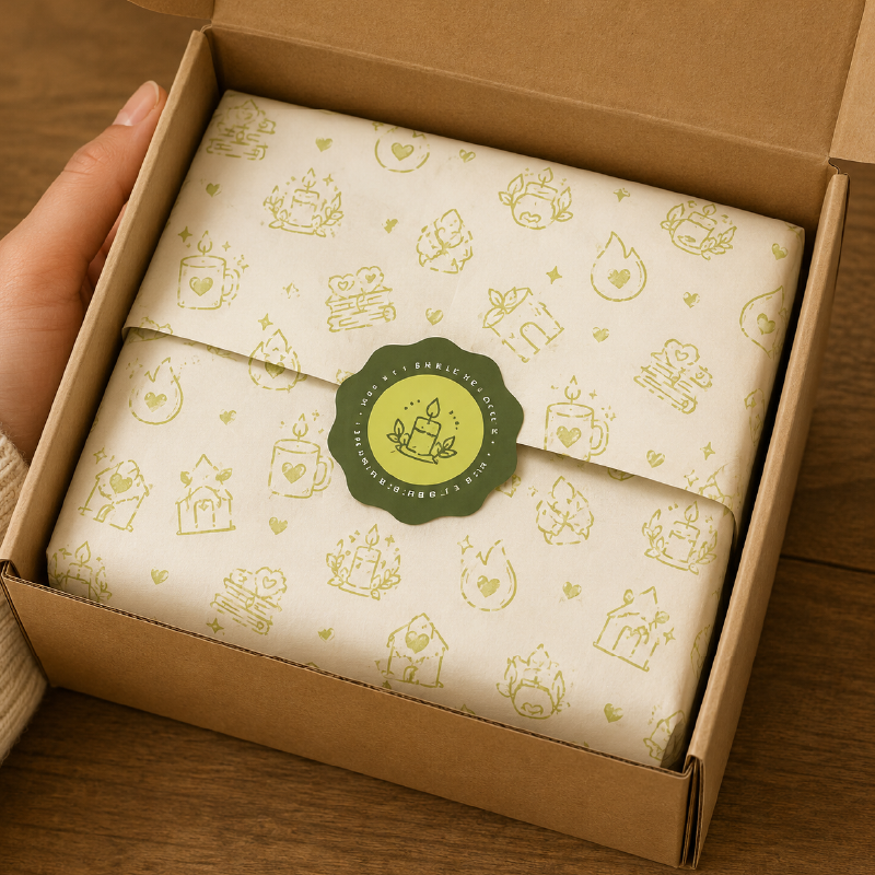
Applications
On packaging and labels, we wanted the textures and details to come forward, so we went for something tactile and considered. In digital spaces, the softness of the palette and the clarity of the forms allow the brand to settle comfortably on the screen, holding attention without overwhelming it.
As the brand grows, this system should provide a strong foundation. New scents, seasonal variations and future collections can unfold naturally within it, each one finding its place without disrupting the whole.


The Result
The final identity for Everlong Scents feels grounded and complete with a sense of calm playfulness that extends beyond the visuals themselves.
The kind of presence that lingers.
Looking to bring your own community brand to life? We’d love to help. Reach out here or browse our branding packages to see what fits.